MatchUp
MatchUp is a young athletic company seeking to combine self-improvement, fitness tracking, and match coordination into one convenient product. They sought help to create their primary app screens, connecting people to play games across skill-levels and tracking their growth over time.
Team
1 UX Designer, 3 Developers, 1 Founders
Role
UX/UI Designer
Solution
I utilized popular contemporary design interactions to help folks navigate a new type of application. Understandable interaction points are key to onboarding and retaining new users.
TL; DR
Click below to jump to the prototype solution.
The Prompt & Scope
To design the UI and create three basic user flows for Matchup’s app: onboarding, skill assessment, and match-making. It was important to move quickly but carefully as this was the company’s first product.
The initial launch will focus on partnerships with academies and schools interested in trying this new app to help simplify their sports.
“I don’t like to wait… When I get to the field, I want to play now.”
– Student, soccer enthusiast, 17
Research
I began my research by surveying the competition to best understand the market. I found that although there were products within this space, nothing quite lined-up: they were either fitness products, or social media apps. Some of the apps I looked to for inspiration included Strava, Facebook, Reclub, and Matched.
This app will first launch overseas where the Android OS is most popular. I took some time to dig into material design systems to better understand and design for this audience. Further, I took the time to research form design and interaction design to best suit the user and the app.
I lucked out and conducted a few brief interviews with potential users of the app. Some of the key takeaways were the frustration with finding different venues to play their sport, but also in finding people of similar skill levels. Some matches were too unbalanced leaving both players unhappy.
Sketching
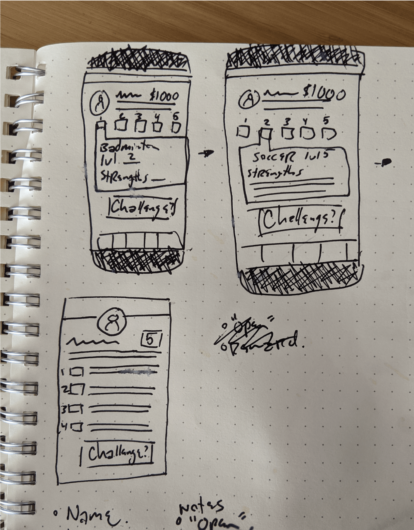
I think best with a pen in my hand. Quick sketches of possible layouts and jotting notes. It’s easy to draw something quick and either disregard or iterate further.
My early designs show a player’s profile page (something that was not within the scope of this project). It helps me to think and plan to visualize the other components not shown, in order to make sense of what’s vital.
“I want to play against other people, that I don’t know… I want a challenge.”
– Student, badminton player, 15
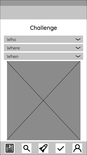
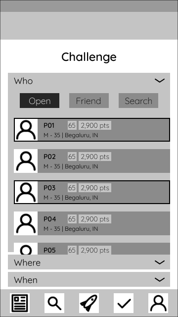
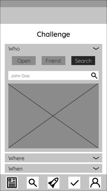
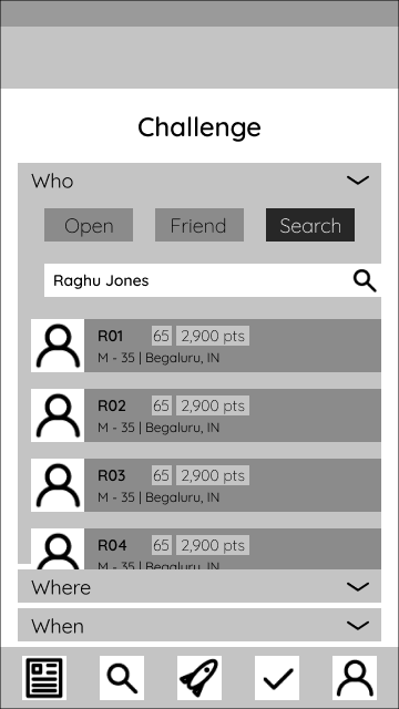
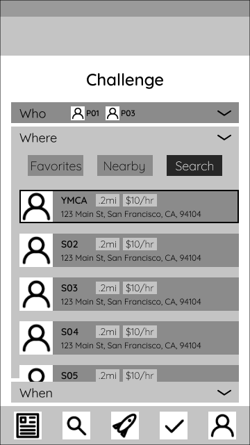
Who
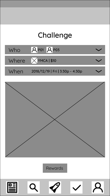
The “Who” tab is where users search for people to play with. Searches for friends, random players, or specific people were all possible. This allows the user flexbility when it comes to their time, location, and desired workout.
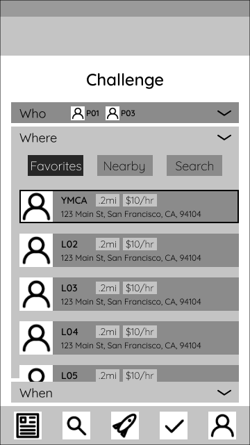
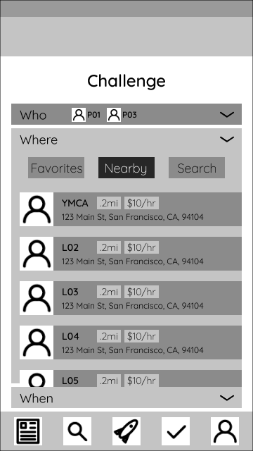
Where
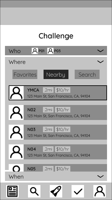
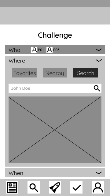
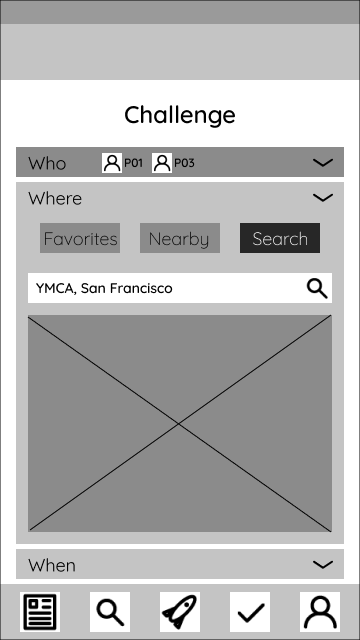
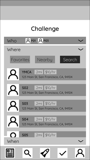
The “Where” tab displays courts, fields, pitches, and more places to play your games. It’s broken into three sections: Favorites, Nearby, and Search (all pretty self-explanatory). As an MVP, this would allow users to quickly find places to play in a variety of manners.
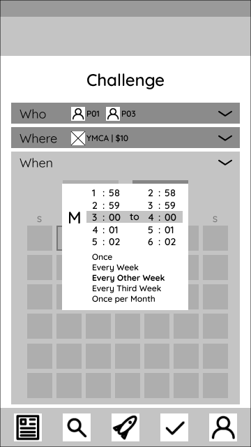
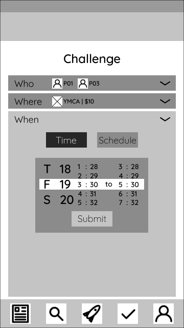
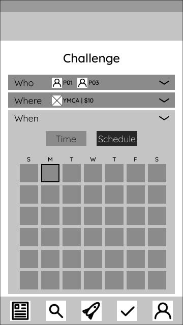
When
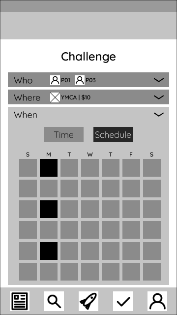
The “When” tab introduces two new interactions: a time dial, and a calendar. The dial would allow for quick scrolling to set each parameter. The gesture is simple and well established and hopefully prove intuitive.
The calendar would be straightforward: selecting a date would open a modal window to schedule a time slot as well as frequency.
Rewards
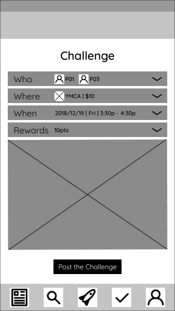
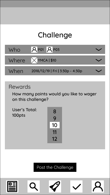
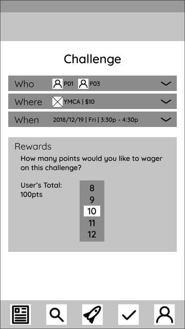
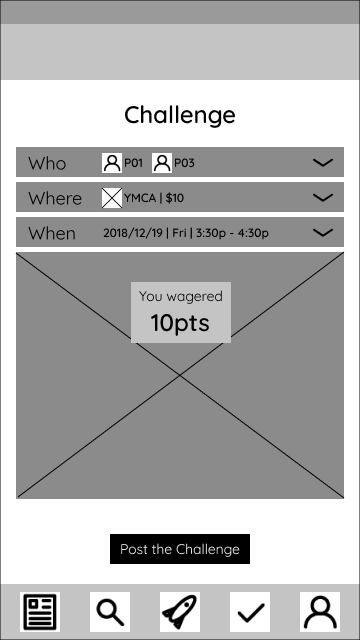
A major feature that the team wanted to implement was a points system, to encourage sportsmanship and engagement. Players would be encouraged to play above their skill level to improve and could choose to wager points on matches.
I reused the scroll idea to allow users to quickly select a number of points to wager. This could easily be done quickly, and one-handed while players prepare to begin their match.
Skill Assessment
The second of the required user flows. The user would record how they felt they performed during the match. Through my interviews I found that post-game players are tired, sweaty, and ready to hit the showers. Knowing this I designed sliders to allow players to quickly record how they felt. This quick input would help track their progress, and overtime show trends in performance, strength, and skill.
Results and Reflections
The major takeaways from this project were to spend the time early on to do the extra work to create a solid foundation. By meeting with the stakeholders I got a greater sense of where to focus and what their concerns were. Spending the time researching the competition, design systems, and UX tenets helped guide me greatly. I sketched and asked for feedback early-on. These crucial design steps really reinforced this old adage for me: ‘Measure twice, cut once.’
