

Global Header + Contact Options
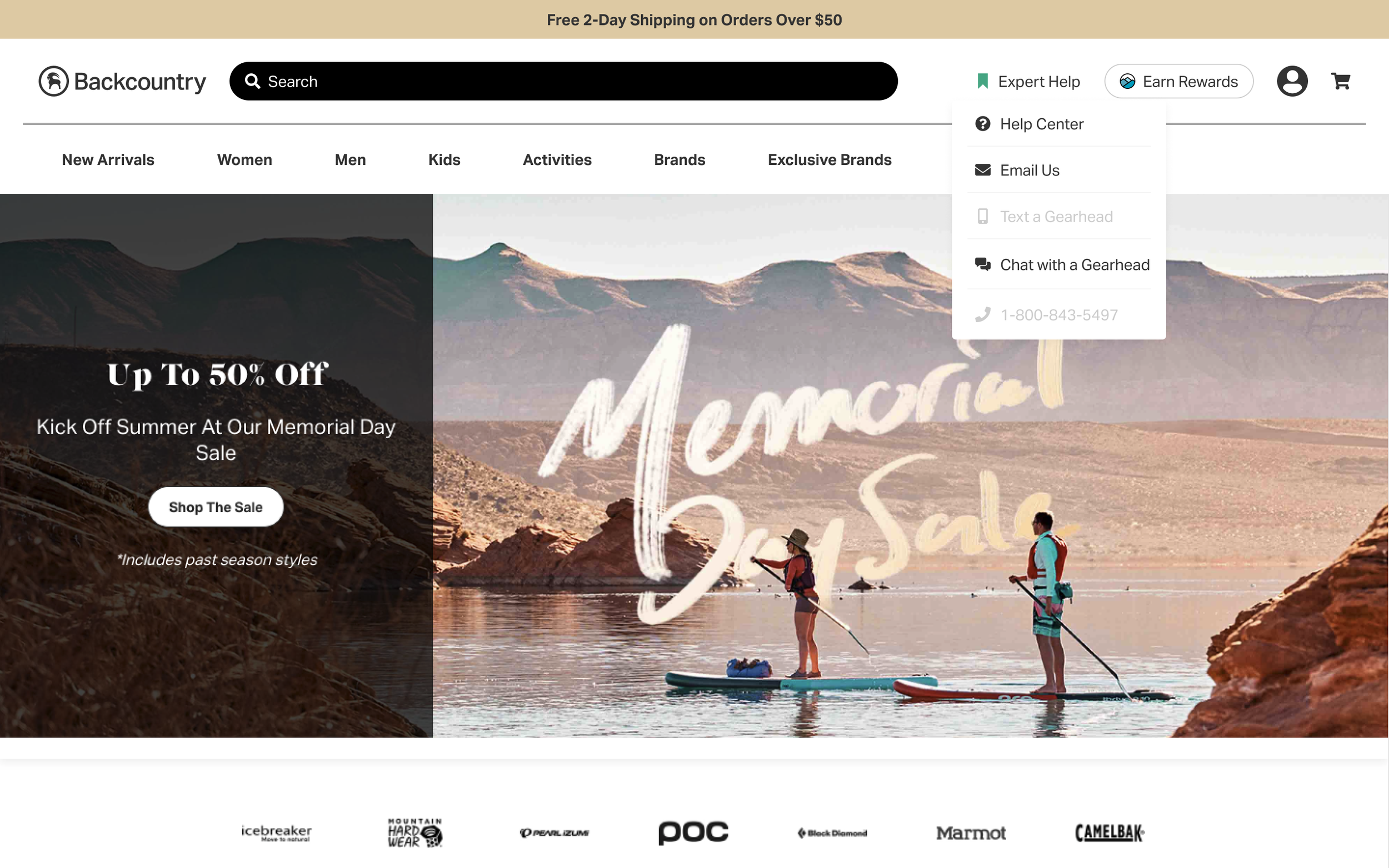
After a recent update to our global header, we needed to centralize and highlight our contact methods more prominently. As the new header was finalized, we had spatial constraints to fit this element in.
Team
1 UX Designer, 1 Product Manager, 4 Engineers
Role
UX Researcher, UX/UI Designer
Solution
We created a simple flyout of the 4 contact options, omitting any extra info in favor of comprehension and readability.
TL;DR
Click below to jump to the prototype solution.

Research
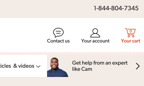
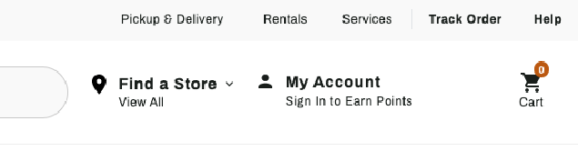
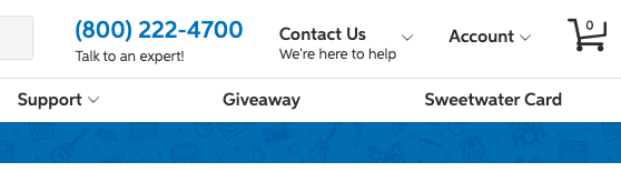
After kickoff, I began by emulating a user and going through the process to find all of our contact options. I created a quick journey map (refined to the right), then moved onto surveying our top E-Comm competitors to see how they placed & displayed their contact options. Most had some form of contact in their Header/Global Nav, while everyone had an option in their Global Footers (email sign-up, contact page, etc).
At the time, we had email sign-ups in the footer. Creating a second home in a prominent location would be in-line with our competition, and made logical sense.


Sketch
I’m a doodler at heart: I’m constantly noodling out ideas or scrawling down competitor designs.
As expected, we hit a few snags when trying to fit all of the necessary information: contact methods, differing hours & days of operation, disabled states, and existing code components.
Some ideas I played around with: simplified/universal icons, drop downs, and layout tweaks (if we were forced to re-imagine the header).
Through the sketches shown below, I was able to hone in on a few key ideas:
How large a footprint do we want for this option?
How would it interact with other menu flyouts?
Must we show each option’s hours?
Alternative layouts, if this proves too difficult
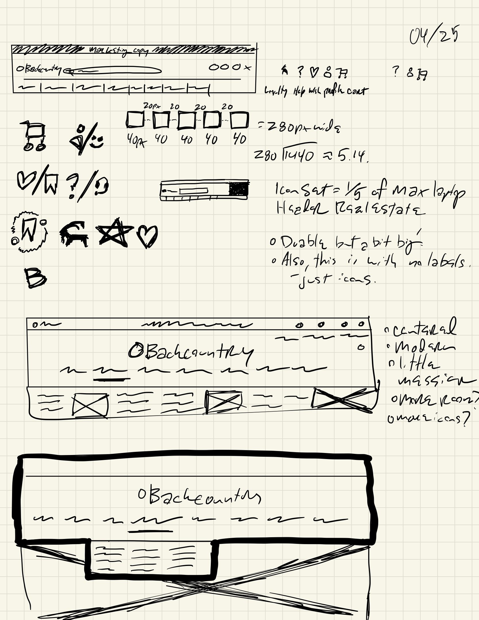
Icons, layout, headers
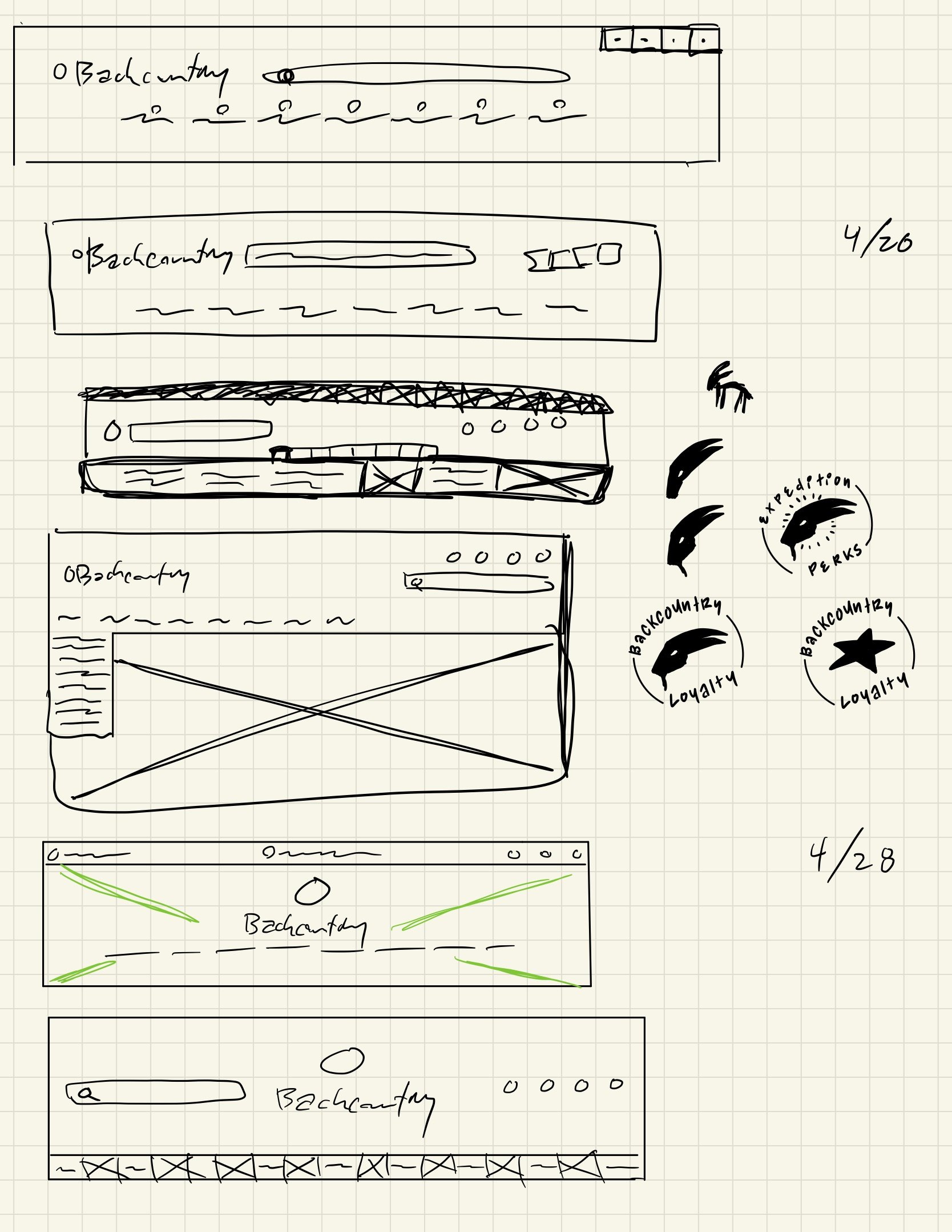
Header layouts, Logo doodling

Alt. Header layouts

Wireframes
I moved from notepad to Figma, translating some of the sketches into high-fidelity wire-frames. As I’d already fleshed them out on paper, I felt sure about moving straight into hi-fi mocks.
I landed on three different options to design and test: ‘simple’, ‘hidden hours’, and a ‘dyanamic/nice to have’ option. Each of these met a different point of criteria:
Simple flyout: static, easiest for our developers as this asset was widely used across the site. This would mean a quicker development, quicker implementation, and assurance of functionality.
Hidden hours flyout: hid the complicated hours of operation, but made them toggleable.
Dynamic/Nice to have: More complicated, showed hours dynamically based on a user’s location. A similar component existed, but would require additional development work to function here.


User Testing
I created the usability test’s in UserZoom to gauge each design’s unique usability and efficacy:
Where would you go to contact customer service?
What contact options are available to communicate with customer service?
When will customer service be available to help you?
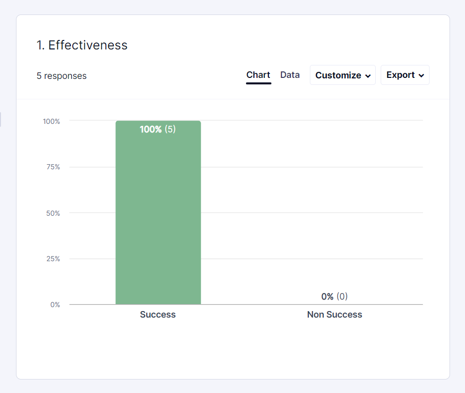
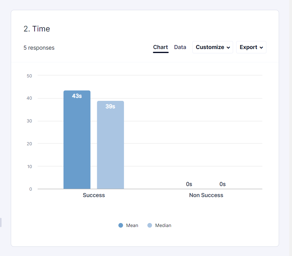
Unfortunately/fortunately- the results all came back very positive with no clear winner. The ‘Simple Flyout’ had a slightly longer time-on-task, but this could be accounted for as it was first (by the second and third designs the user knew the structure of the test). In light of this, my Project Manager and I collaborated on our pitch to our stakeholders.
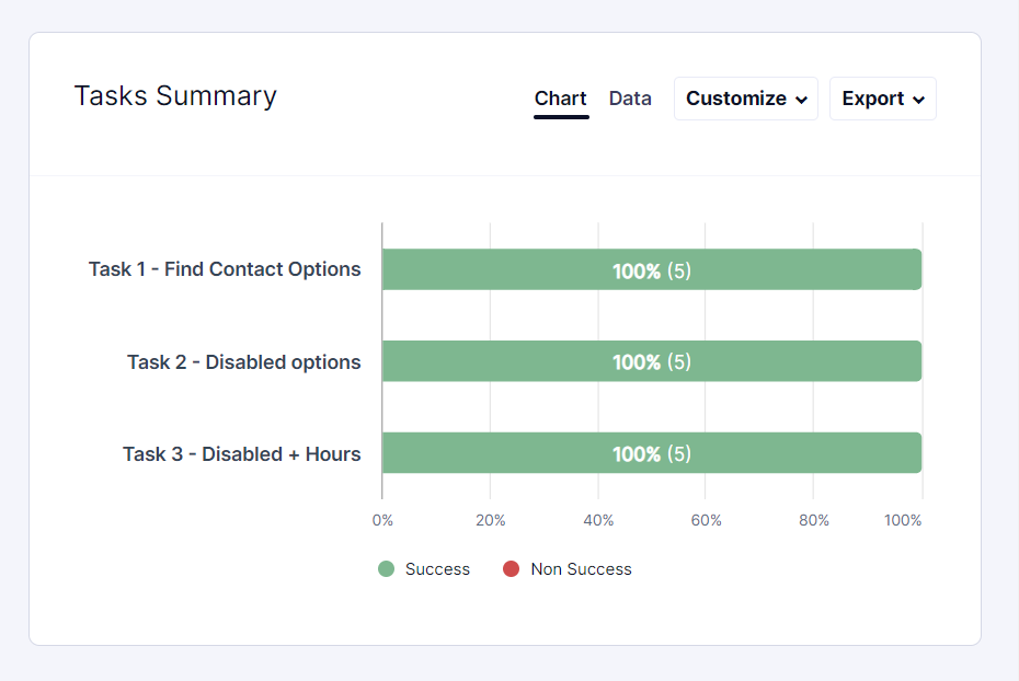
Overview

Task 01

Task 01: Success

Task 01: Time

Task 02
Task 02: Success
Task 02: Time

Task 03

Task 03: Success

Task 03: Time

What People Said
“For me personally, I’d choose chat, and that’s pretty darn easy to find.”
— User #3
“…5- very easy. I liked how many options there were.”
— User #5
“If I have a choice, I’d go to the help center- and then potentially call, if I need more help.”
— User #4
Presentation
As the user testing results were positively neutral, we attended the weekly stakeholder meeting to present the designs, the testing results, and our proposal: the ‘Simplified Flyout’ option.
My PM and myself favored the simple design: it was sleek, had a smaller footprint, and the core component already existed in the dev. library. A few higher ups favored option 2 which always showed option’s hours. Through this project, I’d come to understand that hours were listed in several other places (the chat widget, SMS modal, and upcoming “Contact Us” page). As such, we were able to convince the group that the ”Simple Flyout” would be the best choice. With everyone aligned, I handed over the mocks and specs to our engineering team.

01. Cover

02. Goal

03. Proposal (collapsed)

04. Proposal (expanded)

5. All Desktop & Mobile

6. Mobile A

7. Mobile B

8. Guest & Logged In Users

9. Mobile + Rationale
Lessons & Reflections
The major lesson I took away from this problem was, that despite how obvious the solution appears in hindsight, you can’t cut corners nor gloss over the path that got you there. The simplest solution makes sense, but had I not looked to the competition, sketched out ideas, and tested those ideas with users I would have no way of validating my assumptions. It’s the core distinction between basic & user-informed design work.
Further notes:
I expected and hoped for a clearer winner after user testing. With no direction there, my PM and I based our decision on other business factors (financial, developer workload, tech maintenance).
I was proud of my growth in presenting, explaining, and advocating for my designs. It took the presentation and some negotiating for everyone to reach an agreement.
I enjoyed working closely with my engineers and learning more of their world. I’m happy that we arrived at a solution that worked for the users and wasn’t a huge burden for them. This also made for a quicker/cheaper rollout, and enabled them to move onto other work.
Next Steps
The next step after this was to create a new “Help Center” page where all contact options would live: this would be linked in the Footer. This page worked with the “Simple Flyout”, as there would be a dedicated space for displaying hours, more info, FAQs, and other self service resources.
Although we had just redesigned the header, there was still some appetite to take another pass at it. During this project I sketched a couple new Header layouts that I was excited about. I think they are another step towards a streamlined, contemporary ecommerce aesthetic. I’ll raise the designs during the Holiday code freeze/planning to get feedback.